top of page


Pendola Project
Pendola Project is a performance coaching company focused on helping runners and athletes build strength, stay consistent, and improve mobility. I was tasked with designing a compact information card for the Reno Tahoe Odyssey Race that clearly communicates the brand’s core mission and services, while staying visually aligned with its athletic identity.
I used simplistic typography, dynamic lines, and a strong hierarchy to reflect movement and strength. The color palette was drawn from the brand’s existing identity—clean, energetic, and performance-oriented.


Crush Nutrition
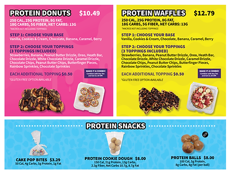
Crush Nutrition is a small business offering protein shakes, energizing teas, and healthy meal replacements. I was tasked with designing a visually appealing, easy-to-navigate menu that reflects the brand’s energetic and health-focused identity.
I created a picture-oriented layout per the client's request and used bright colors and bold typography to highlight product categories and nutritional benefits. The menu balances fun and functionality, making it easy for customers to quickly find their favorite items or explore new options. Icons and subtle graphic elements were used to emphasize freshness and energy.
bottom of page